The Ripple Dashboard provides your team with a real-time overview of your recruitment efforts and participant demographics. It allows you to monitor progress toward your recruitment goals, analyze the effectiveness of your recruitment sources, sites, and strategies, and track key demographic information relevant to your research.
The Dashboard also includes a visual graph of your weekly enrollment trends, helping you stay informed and make data-driven decisions.
Metrics tracked on the Study Dashboard
The Dashboard is composed of several key analytics sections:
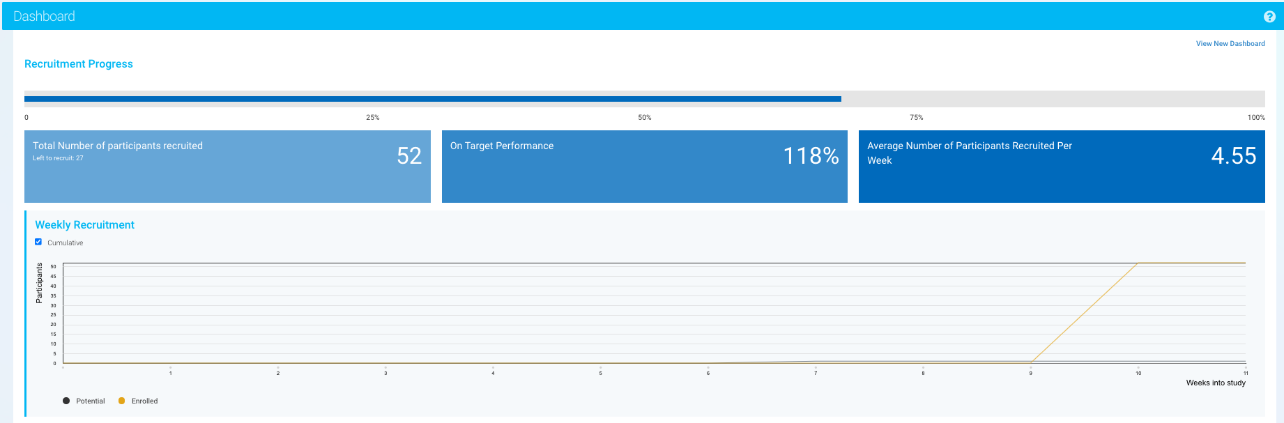
Recruitment Progress
The Recruitment Progress section offers insight into:
-
How recruitment is progressing over time
-
Your recruitment efficiency
-
Whether you are on track to meet your enrollment targets
In the accompanying bar graph:
-
The black line represents the number of potential participants added.
-
The yellow line shows the number of participants enrolled each week (those moved to the Enrolled Participants page).
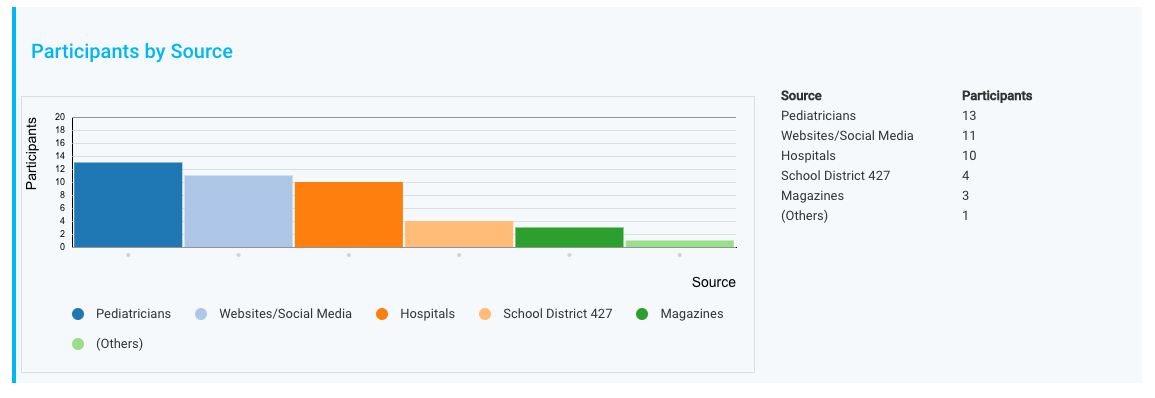
Participants by Source
This section charts where your participants originated based on your defined Recruitment Sources (e.g., Facebook Ads, Doctor Referrals, Flyers).
You can customize Sources under the Recruitment tab in Study Settings.
Working with Recruitment Sources article can be found here.
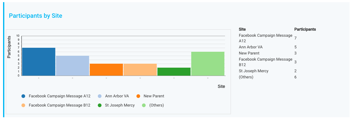
Participants by Site
This section displays participant distribution across your defined Recruitment Sites (e.g., Clinic A, Hospital B).
Sites are customized under the Sources and Strategies settings.
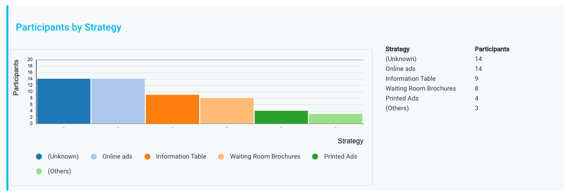
Participants by Strategy
This section charts participants acquired based on your Recruitment Strategies (e.g., Fall 2025 Social Media Campaign, Community Health Fair).
You can manage Strategies within the Recruitment tab.
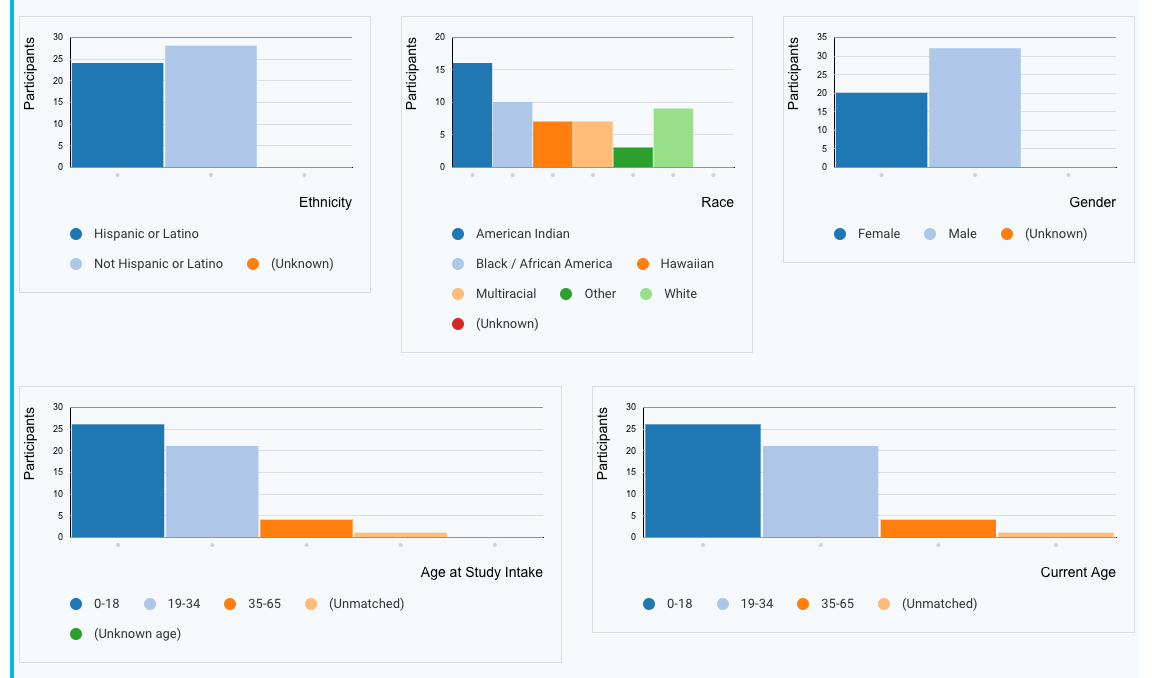
Overall Enrollment Summary
The Overall Enrollment Summary provides a broad overview of:
-
Recruitment progress
-
Potential and Enrolled Participant Status categories (e.g., Screening, Enrolled, Completed)
-
Key demographic breakdowns based on your custom study fields
This section helps you quickly assess participant distribution across critical milestones and demographic variables.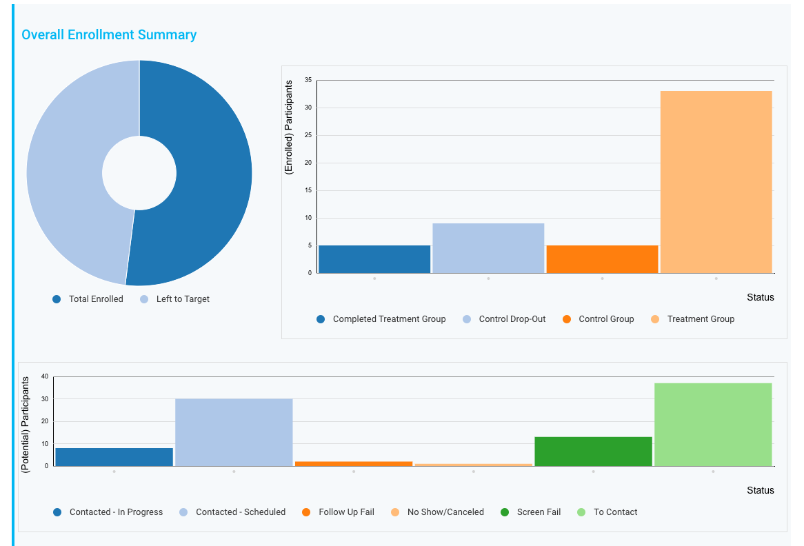
Viewing Data in Table Format
In addition to visual graphs, you can view all Dashboard data in a tabular format:
-
Click the Show Table button.
-
The table will display all data, including any Tags attached to participants, allowing you to view statistics across your custom Tag categories.
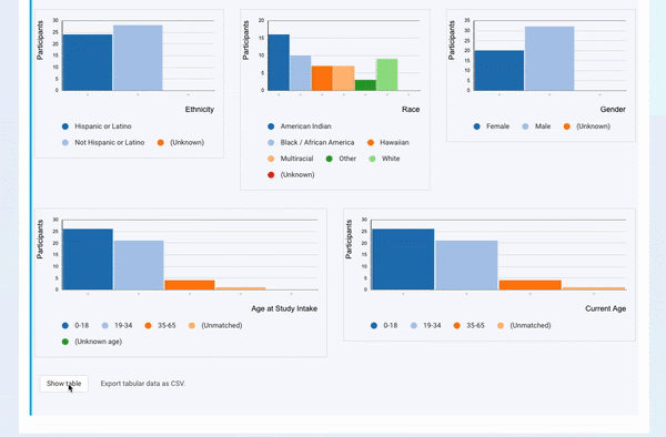
Exporting Dashboard Data
If you need to work with the data outside of Ripple:
-
Click Export Tabular Data as CSV.
-
The dashboard data will be downloaded into a CSV file.
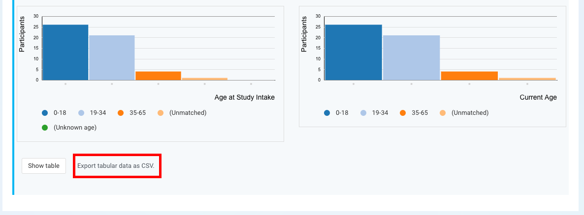
3. The exported file will include all relevant statistics organized in an easy-to-read table format.
This is a great way to back up your dashboard insights or prepare them for external reporting.
 Was this