Menu Overview
- Purpose: The Menu element enables the creation of a navigation menu or bar within an email.
- Link Arrangement: Hyperlinks can be arranged horizontally or vertically to resemble a navigation menu or bar.
- Use Cases:
- Add links to social media, website, privacy policy, or other important pages.
- Replicate your organization’s top menu or footer menu for consistency with your website.
- Benefit: Enhances user experience by making navigation easier, allowing recipients to quickly access relevant links.
 How to Add the Menu Element to Your Template
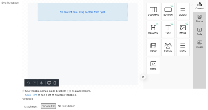
- Go to the Content Section: Ensure you are in the Content section of the email editor.
- Select the Menu Element: Click on the MENU icon.
- Drag and Drop: Drag the MENU element onto the Email Message template to add it.
Properties of the Menu Element
- Customization Modes: Available in Desktop and Mobile modes.
- Desktop Mode: Provides full styling and customization options.
- Mobile Mode Limitations:
- Cannot add new menu items.
- Cannot select the font family.
- Cannot set font weight (regular or bold).
- Cannot choose text color or link color.
- Cannot align text within the menu.
Menu Items
- Adding URLs: Enter the URL and the display text to disguise the link.
- Multiple Links: Click "Add New Item" to include additional URLs.
- Opening Behavior: Choose whether the link opens:
- In the same webpage/tab (replacing the current page).
- In a new webpage/tab (keeping the current page open).
Text Customization in the Menu Element
The Text section allows you to modify the text of the URL.
- Font Family: Select a group of fonts to determine the text style.
- Font Weight: Choose whether the text is bold or regular.
- Font Size: Adjust how large or small the text appears.
- Text Color: Set the color of non-hyperlinked text.
- Link Color: Choose the color of the URLs or hyperlinks.
- Alignment: Position text left, right, center, or justified.
- Layout: Display menu items horizontally or vertically.
- Separator: Select a character (e.g., |, /, -, etc.) to separate text or URLs.
Padding in the Menu Element
- Purpose: Controls spacing between the menu border and its content, as well as between text or URLs within the menu.
- Customization: Enhances readability by allowing items to be spaced more clearly.
- Padding Adjustments:
- Found in the Styles and General sections.
- Toggle the "More Options" button (red) to individually adjust top, right, left, and bottom padding.

Responsive Design for the Menu Element
- Device Customization: Ensures menus display correctly across desktop and mobile devices.
- Visibility Control: Menus can be shown or hidden based on the recipient’s device.
- Editing for Devices:
- Click the desktop or mobile icon or select the Desktop/Mobile tab in the editor.
- Customize different aspects of the menu for each device.

- Hiding the Menu:
- Toggle "Hide on Desktop" or "Hide on Mobile" to control visibility.
- Hidden menus will appear faded in the editor but will not be visible to recipients on the selected device.
