The Button element in Ripple’s email templates allows you to create clickable buttons that perform specific actions—such as directing participants to a website, survey, email, or phone call. This feature is ideal for driving participant engagement and simplifying calls to action (CTAs) within your email communications.

Adding a Button to an Email Template
To insert a button into your email template:
-
Open the Content tab in the email editor.
-
Click the Button icon.
-
Drag and drop the Button element into your email layout.

Button Customization Options
Smart Buttons (Desktop Only)
The Smart Button feature helps enhance your button text using AI-generated suggestions. After entering your text:
-
Select from AI-recommended options to improve clarity or tone.
- Select a Preferred option (red)
-
Adjust the style to match your message (e.g., friendly, professional, witty). (green)
Note: Smart Button functionality is not available in Mobile mode.

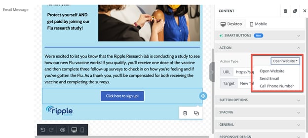
Action Settings
Define the button’s behavior when clicked by selecting one of the following actions:
-
Open Website – Redirects to a specified URL (choose whether it opens in the same or a new tab).
-
Send Email – Opens the recipient’s email client with a pre-filled address, subject, and message body.
-
Call Phone Number – Initiates a phone call (when clicked on a mobile device).
:
Warning
⚠️ Important: The Send Email and Call Phone Number actions may not work on all email clients or devices. If reliability is critical, consider using a traditional hyperlink instead.
Design and Layout Settings
Button Appearance
Customize your button's look and feel using the following options:
-
Text Color – Change the color of the button's text.
-
Background Color – Set the button’s background color.
-
Auto Width – Automatically resize the button or define a fixed width.
-
Alignment – Align the button left, center, right, or justify within the content block.

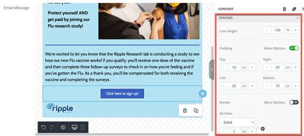
Spacing and Formatting
-
Line Height – Adjust vertical spacing between lines of text within the button.
-
Padding – Modify the spacing between the button’s border and its content.
-
Use the More Options toggle to adjust padding for each side individually (top, right, bottom, left).
-
-
Border – Customize the button’s border thickness, color, radius (rounded corners), and style (solid, dotted, dashed).
General Layout
-
Adjust the spacing between the button and the surrounding container (column or row).
-
Use the More Options toggle to fine-tune padding for each side of the button’s placement area.

Responsive Design Controls
The Button element is responsive and can be customized for desktop and mobile viewing modes. To access device-specific settings:
-
Use the Desktop and Mobile tabs at the bottom left of the editor.
-
Alternatively, click the corresponding desktop or mobile icon within the editing toolbar.
Device Visibility
You can choose to hide the button on specific devices:
-
Hide on Desktop – The button will only appear on mobile.
-
Hide on Mobile – The button will only appear on desktop.
When a button is hidden on a device, it will appear faded in the editor preview to indicate its limited visibility.
