The Column element lets you divide a content area into multiple columns for better organization and alignment of images, text, buttons, and other content.
- Column Customization Options: Adjust column colors, spacing, visibility, and more.
- Purpose: Improve readability and create visually appealing emails.
- Benefits: Helps structure email content for a clean and organized layout.

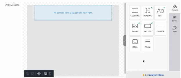
How to Add the Column Element to Your Template
- Navigate to the Content section of your email editor.
- Locate the COLUMN icon.
- Click and drag the COLUMN element onto the email body where you'd like it to appear.
Properties of the Column Element
-
Modes: Customization is available in both Desktop and Mobile modes, but Mobile mode has limited styling options.
- Desktop Mode: Supports multiple columns in a single row.
- Mobile Mode: Converts multiple columns into separate rows and does not allow multiple columns within one row.
-
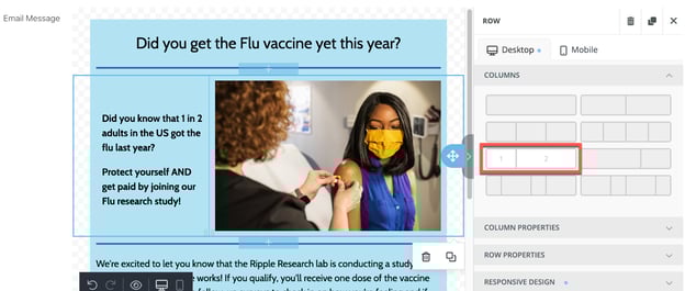
Columns Section
- Allows you to select up to 4 columns in a row.
- Offers pre-determined spacing options.
- Enables further adjustment of column width after adding them to the email body.
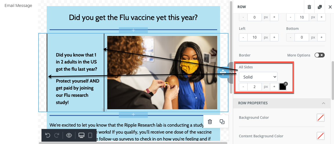
Column and Row Properties
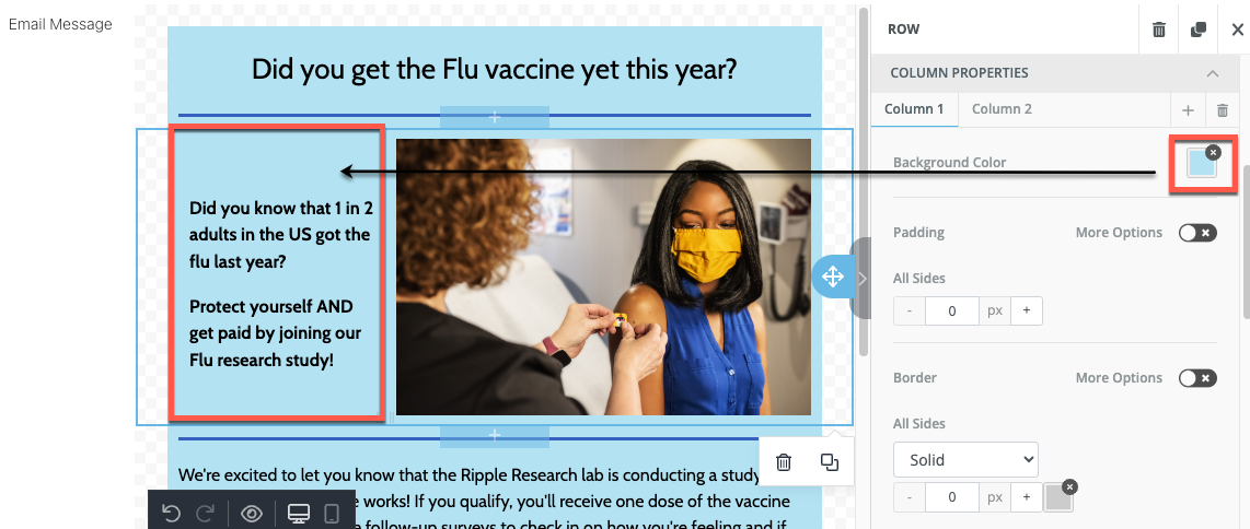
Column Properties
- Background Color: Set the background color behind text, images, buttons, etc.
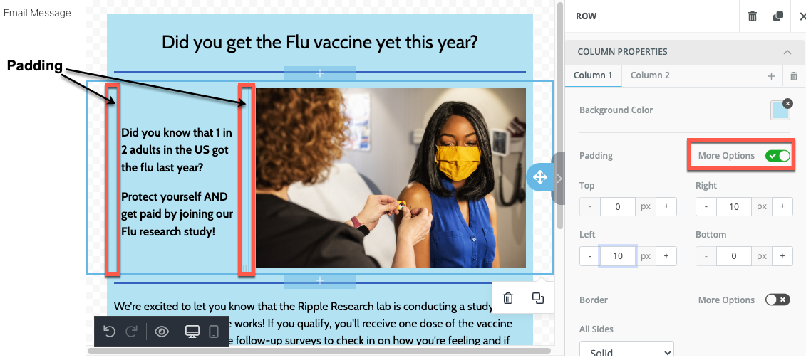
- Padding: Add spacing inside the column’s border to separate items; use “More Options” to customize padding for top, right, left, and bottom.
- Border: Add and customize a border around the column, including size, color, and format
Row Properties
- Background Color: Set a background color for the row; padding shows this color between columns and the row border.
- Content Background Color: Assign a background color for email content to enhance readability and match branding.
- Background Image: Use an image or video as the background, with adjustable settings and positioning. Read more about impact of background colors here.
- Padding: Add spacing between the row’s border and the columns, customizable on all sides. Toggle "More Options" for customizing.

Responsive Design
- Customize email design for different devices (desktop or mobile):
- Hide Columns: Option to display or hide specific columns on either desktop or mobile devices.
- Toggle on either "Hide on Desktop" or "Hide on Mobile"
- Hidden columns will appear faded within the template and will not be visible to participants viewing on the specified device.
- Customize for a Specific Device:
- Click Desktop Icon or Mobile Icon
- Edit columns based on device used to view email
- Hide Columns: Option to display or hide specific columns on either desktop or mobile devices.
This flexibility ensures emails look polished and functional across devices.

Mobile-Specific Options
-
-
- By default, elements stack in individual rows on mobile.
- Use "Do Not Stack on Mobile" to maintain columns in one row instead of stacking.
-
- Preview and edit for desktop or mobile via corresponding tabs or icons.
